Functional CSS: An approach to styling
I was never particularly happy with CSS styling because I didn’t have a good way to think about it. BEM, OOCSS, and SMACSS all provide useful tactics on how to make CSS more manageable – BEM has good ideas about visual decomposition, SMACSS promotes base/layout/module/state/theme separation, and OOCSS highlights the importance of composability – but none provided the clear mental model I sought.
For some styling work I did earlier this year, I took the time to figure out how I would like to think about styling and came up with the block/slot model, which I’ve found to be easy to visualise, easy to use, and make styles robust and maintainable. It boils down to two CSS tactics that you could consider a simplified synthesis of BEM, OOCSS, and SMACSS.
The approach is nascent, but it has been productive and smooth so far. I’ve also found myself enjoying CSS more, similar to how I enjoy programming more when I can use pure functions and immutable data. If you decide to try it, I’d love to hear about your experience.
Please note that this approach is aimed firmly at making the technologies and tools we have today more productive. It does not try to solve the fundamental problems with CSS and browser layout engines.
The block/slot model
To design a page with the block/slot model we divide it into blocks. To see how these behave, consider a simple web-page and the blocks used to construct it:
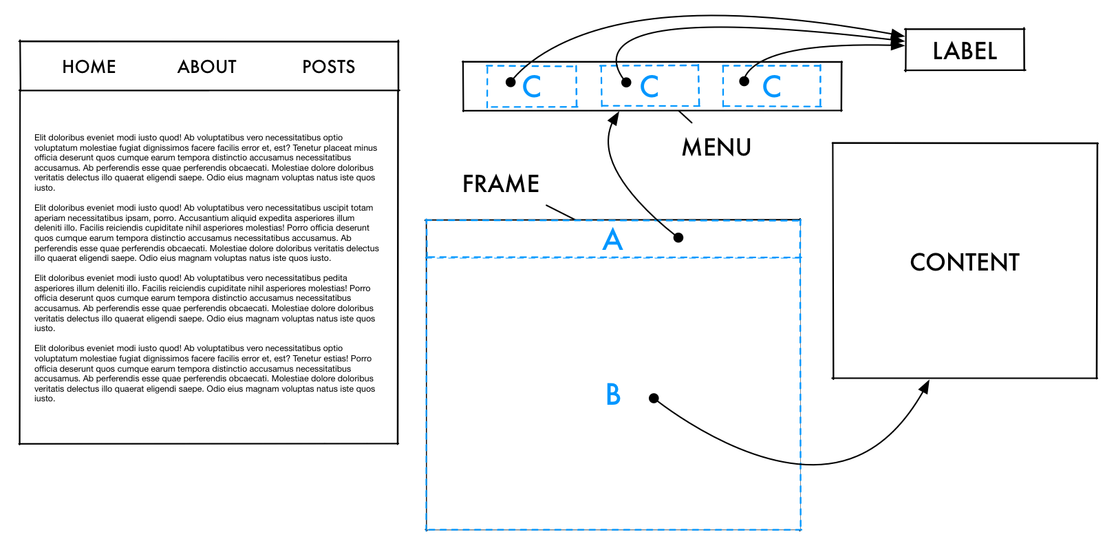
The example design to the left consists of a simple menu with options and a content area below that. It breaks down into four blocks: a frame block, a menu block, a label block, and a content block.
The labeled dashed blue sections illustrate slots; places where other blocks – child blocks – can be placed. In the example design, a menu block is placed in slot A, a content block is placed in slot B, and option blocks are placed in the C slots (which belong to the menu block which itself was placed in the frame block’s A slot).
In other words, blocks form a hierarchy. A block defines how it looks and optionally slots where child blocks can be placed. Blocks do not have to define a fixed number of slots, the menu could for example allow for any number of options.
The distinguishing property of the block/slot model is that blocks do not themselves define their size or position. Instead, blocks take on the shape of the slot they are placed in. This is key for making composition and re-use easy to achieve and reason about. Contrast that with traditional models where blocks determine their own size and position and thus require adjustments depending context.
For example, note how the exact same button block in a block/slot model takes on 3 different sizes and positions depending on the slot it is placed in:
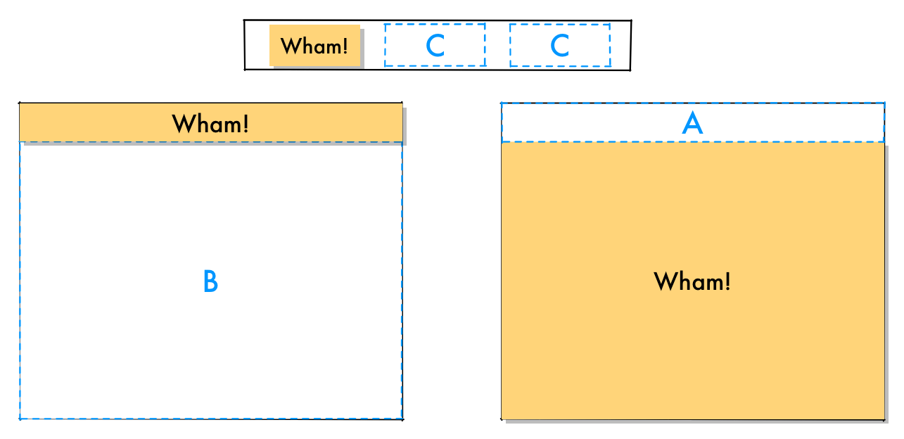
The button in an option slot, the button in the menu slot, and the button in the main slot.
That’s pretty much all there is to the block/slot model. You compose your interface using blocks that define their internal appearance and slot layout, whereas their external interface – size, margin, position, etc. – is determined by the slot they are placed in.
Now let’s look at how we can use this model with CSS and HTML.
“Call” CSS styles from HTML
CSS selectors coupled with specificity rules is a concise and expressive language. The problem is that using expressive selectors quickly becomes complicated and hard to maintain as they start to overlap (and rely on specificity rules) and as the HTML evolves (if you used tag or child selectors).
Instead, we can move control over which styles apply where from the CSS stylesheet to the HTML markup.
You can see similar inclinations in web-components and AngularJS directives. Those make a full vertical cut across content, style, and functionality however and my hunch is that that will generate similar composability problems as object-oriented programming. A clean horizontal layering and a functional approach seems more compelling to me.
We think of this as writing CSS stylesheets that provide a library of style “functions” that are “called” from the HTML to style its content.
Concretely, we simulate function calls with simple class selectors. The style applies only to HTML elements that have that class. Thus, we “call” a style from an HTML element by adding the style’s class to it. This allows fine-grained control over both style and content from one place, the HTML.
It’s worth noting that CSS is not powerful enough to be an independent layout engine since it can’t do content transformations (that is, it must work with the given HTML structure). Thus, the idea that CSS and HTML have separated design and content is folly. I posit that it is simpler to move the control of styling to where the content is defined. In this case that means “calling” CSS styles from the HTML using simple classes. (We could potentially achieve better separation with a JavaScript content transformation library.)
I tend to think of this as roughly analogous to pure functions in the sense that the result can’t be changed externally the way it can if we apply styles via complex CSS selecteors.
Because of how CSS and browsers implement styling, there is unfortunately some magic introduced by default styles, inheritance, and user-agent stylesheets.
This means there is no more need to count selector tags to decode specificity rules or extend a selector to get its specificity to overrule some other part of the stylesheet. Yes, it does mean more classes in the markup, but that’s a small price to pay for the clarity and simplicity gained, or at least I think so. For example:
/* Block styles are named "<blockname>-B" */

.button-B {
    background-color: lightgrey;
    font-style: sans-serif;
    text-align: center;
}<button class="button-B">Click me!</button>
...
<nav>
<li class="button-B">Faux button!</li>
...
</nav>Separate CSS styles for block and slots
The second tactic, which affords composability and re-use, is to separate block styles and slot styles. If we assume we have box-sizing: border-box; and leave out some of the less common properties, the different kinds of styles can be split as follows:
-
Block styles consist only of properties that affect the internal “look” of an element:
background,border,color,cursor,direction,font(-family,-weight,-variant,-style),letter-spacing,line-height,outline,padding,text(-align,-transform,-justify,-decoration, etc.), andvertical-align. -
Slot styles consist only of properties that affect the size or position of an element:
bottom,clear,clip,display,float,height,left,margin,overflow,position,right,top,visibility, andwidth. -
Some properties can be used as either block or slot styles depending on how you think about them:
font-size,list-style,max-height,max-width,min-height,min-width,table-layout.
To style an HTML element as a block we apply the block style for the block we’re defining and the slot style from the parent block. This combination of styles is the key to composability. Elements define their own internal look but get their external properties from one of their parent’s slot styles. Because external and internal CSS properties are sufficiently orthogonal, they compose well (enough) and we can re-use the same block in different slots simply by swapping the slot class in the HTML element while leaving the block class in place.
/* Block styles are named <blockname>-B.
   Slot  styles are named <blockname>-S-<slotname>. */

.frame-B { /* background, padding, font-family, etc. */ }

.frame-S-header {
    display: block;
    height: 5em;
    width: 100%;
    margin: 0;
}

.frame-S-main {
    display: block;
    width: 100%;
    margin: 0;
    min-height: 20em;
}

.menu-B { /* background, padding, etc. */ }

.menu-S-option {
    float: left;
    margin: 1em;
    display: inline-block;
    height: 3em;
}<body class="frame-B">
<div class="frame-S-header menu-B">
<a href="#" class="menu-S-option button-B">Wham!</a>
...
</div>
...
</body><body class="frame-B">
<button class="frame-S-header button-B">Wham!</button>
...
</body><body class="frame-B">
...
<button class="frame-S-main button-B">Wham!</button>
</body>Summary
The block/slot model is an alternative way to think about styling that splits the design into blocks with slots for child blocks, where the slots determine the size and position of the child blocks. This improves composability and re-use. It is more verbose and requires the discipline to split look (block) and layout (slot) styles which sometimes feels tedius, but it pays off in maintainability and robustness. To achive this I recommend two CSS tactics:
-
Simulate “calling” style “functions” from HTML by using only single class selectors.
-
For each block, define one style class for the block and one style class for each of its slots (if any). Then apply one slot style and one block style to each HTML element you want to style. The slot style defines the size and position of the element and the block style defines its look.
I think of this approach as functional CSS since the ideas are inspired by functional programming – the function application perspective, a strive for purity, and the pursuit of composability.
I wouldn’t call the approach functional design however since I think we can do much better if we designed a layout engine from scratch, but with current browser layout engines I’m not sure we can do much better.
I’d like to thank Tomas Carnecky and Jan Sramek for their feedback on drafts.
Appendix
On “style sprinkling”: I like the mental picture of traditional CSS selector usage as a form of “style sprinkling”. What I mean is that we apply styles from outside the HTML by coming up with a set of selector expressions that end up “sprinkling” styles to elements all over the markup. This use quickly becomes difficult to understand as the complexity of the selector expressions grow and specificity rules come into play due to partially overlapping styles.
On alternative layout enginges: Using CSS to implement the block/slot model is not ideal, but we need to work with the tools we have for now. Longer term, we could develop more expressive layout engines and tools for designing in this way. We might want to perform consistency checks at compile-time to help designers construct well-behaved designs. Naive implementations of the block/slot model (like the one we’re working with in this article) are susceptible to inconsistencies like a block specified as larger than the slot it is used in.
On responsive design: The block/slot model should be well-suited to responsive designs. Ideally however, we would think of responsive designs as a function from the window dimensions to a design that includes content structure (HTML) transformations – design :: Window -> Content -> Design.
On modifiers: Style modifications like an inactive state can be implemented with an additional class, mymodifier-M say. Modifier styles should always be defined in conjunction with the block or slot style it modifies: Correct: .myblock-B.mymodifier-M. Wrong: .myblock-B .mymodifier-M.
On skinning: The short version of how to do skinning – to give different clients their own company colours say – is that you mark skinnable elements with an additional skin-M modifier class and then have a separate stylesheet that define styles for .myblock-B.skin-M. Since its specificity is higher than .myblock-B it will always override the basic style. You put these styles in separate .css files (one for each skin) and then include the appropriate one in addition to the base .css file (which remains cached).