The Visual Display of Quantitative Information
Tufte’s The Visual Display of Quantitative Information is considered a classic in information design. It is refreshingly defiant of pointless convention and concretises its discussion on graphical excellence brilliantly with historical examples.
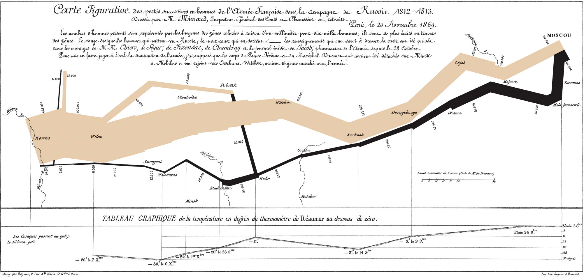
Graphic showing how the size of Napoleon’s army shrank during his invasion of Russia in 1812. Source: Wikipedia
Tufte’s viewpoint boils down to Occam’s Razor: make things as simple as possible, but not simpler. If you already appreciate this, there are no significant revelations. It is not a text-book – not the Strunk and White of visual design that Amazon claims. His arguments, though mostly wise, are disorganised and reduce with little loss to:
Graphical excellence is that which reveals the complex, that which gives to the viewer the greatest number of ideas in the shortest time and in the smallest space. To achieve this, maximise the data-to-ink ratio and, when appropriate, use small multiples to encourage comparisons.
That said, if Tufte’s aim is to exemplify rather than teach, he succeeds. You will learn by example. His focus is on the importance of maximising the data-to-ink ratio (which he attacks in the guise of chartjunk, data density, and multifunctioning graphical elements). As an added bonus, the book has the rare quality of being short – less than 200 pages, most of which are devoted to examples. Well worth the time.
References
Edward R. Tufte, The Visual Display of Quantitative Information (Connecticut: Graphic Press, )